
Nancy Edmonds Hanson
hansonnanc@gmail.com
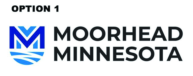
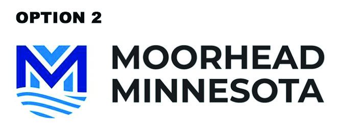
Creating a new city logo was almost an afterthought of a much larger project to “rebrand Moorhead’s identity,” says government affairs director Lisa Bode. But when she invited citizens to choose between two design options Monday, her online post touched off a firestorm.
“We’re pressing ‘pause’ on the process,” she adds. “We will need to reevaluate.”
In the first 24 hours after requesting comments by email, on the city’s website and in a post on social media, she received a torrent of responses. More than 100 Moorheaders had their public say on the city’s Facebook page as well as a shared post by the Moorhead Extra. Virtually all reacted negatively to the new design proposed to replace present graphic, an emblem featuring the peaked roofline of the Hjemkomst Center within a sky-blue circle.
“Change is always going to be hard. We knew that going in,” she says. “Clearly, people are even more passionate than we expected about this symbol of their city.
“That’s not disappointing at all – it’s a really positive thing.”
Her sunny response to the chorus of critiques is based on the much larger project in which the logo was little more than a footnote. For the past six months, the city’s elected officials and staff have been engaged in a project to capture local residents’ loyalty to their community in concise words – a “rebranding” exercise intended to shape a message to assist in marketing the city.
The rebranding project emerged from city leaders’ strategic planning meetings in 2018, she explains. “We wanted to uncover and articulate who and what we are as a community. Why do peole choose to live in Moorhead? Why are they so passionately loyal to this community?”
The city engaged a Fargo consultant, Mel Nelson of Executive Management Systems, to help them through the strategic process. He, in turn, recommended the Austin, Texas, advertising and marketing firm Root + River to query local residents and develop a “brand narrative” and plan for implementation. “We liked the process they proposed, developing new information rather than drawing from what we already knew,” she says. The city council approved a $35,000 contract with the consultants in December.
The consultants spent two days here in February, Lisa explains … or, as it turned out, four and one-half, since a blizzard delayed their departure. They met with a focus group including all elected city officials as well as the heads of city departments. They also circulated a survey to 70 appointed and elected officials representing the school system, colleges, county commission, arts commission and virtually every other city committee. The question: What does Moorhead mean to you?
“They found a consensus, and that developed into a new brand narrative,” she reports. Here’s what they came up with:
“We believe this is where the strong belong. Moorhead is a rising metro. We are growing a vibrant business, academic and art community. We have a culture of achievement, rooted in the spirit of curiosity. Here, we choose to be more.”
Root + River is currently developing a series of “brand stories” in which local residents express their enthusiasm for their hometown. The stories – quoting, among others, Steve Scheel and Mayor Johnathan Judd – will be posted to the city website. In addition to their work, the Fargo video production firm Tellwell is producing a video of similar stories at a cost of $8,500. Matt Cullen’s testimonial is among those that will be featured. Both will be used for a variety of marketing initiatives.
The results of the rebranding project will be debuted to local residents next month during Greater Moorhead Days. “We want to celebrate the strong, enthusiastic loyalty our residents have for their community,” Lisa explains. The “identity party” is scheduled for 7 p.m. Tuesday, Sept. 10, at the Bluestem Center for the Arts.
Lisa emphasizes that developing a logo wasn’t part of the original contract. “If we’d set out to just develop the logo, I think we would have gone about it differently,” she muses. Instead, the city negotiated its design as part of the original contract at no additional cost.
Origins of the current “sail” logo are fairly obscure. It began to supplant the notorious logo from the late 1980s at least 15 years ago. The previous design substituted the shape of Minnesota for the “R” in Moorhead; unfortunately, since the state looks more like a “K,” it became derisively known as “Mookhead.”
Various combinations of the Hjemkomst profile and the city’s name came into ruse. In 2013, according to Lisa, then-city manager Mike Redlinger pulled the variations together and developed a single emblem and design standards, including the particular shade of blue now familiar from city signage and stationery.
The proposed new logo adds “Minnesota” along with the city’s name because research shows Moorhead residents identify strongly with their state. The half-circle beneath the letter M is intended to evoke the meandering Red River and, in the second option, either waves of water or snow. According to Lisa, the two options presented this week represent the fourth iteration of the design process and the first on which the planners could themselves agree.
The city is still accepting comments, though Lisa suggests the strong response on the first day after it was revealed has already applied the brakes to the process. To view the designs and register your comments, go to cityofmoorhead.com/about-the-city/news and choose “new Moorhead logo update.”


